So far we have seen two ways to express data to our audience:
- The first is to simply show the full data set in a spreadsheet or table-style chart and then use large boxes (semi-transparent white) to block out the data we don’t wish to focus on and use bright outlined circles or boxes to highlight the data we do want to discuss.
- The second is to make a graph to show the relationship of a smaller but critical subset of the numbers.
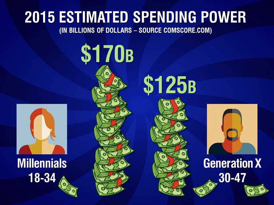
- The third way is to more fully illustrate our numbers than just showing a simple graph.
PowerPoint has a rather clumsy graph function that will automatically generate a bar, line, pie or other style graph. Unfortunately these default graphs are often more difficult to understand than just the plain data. I often choose to create a graph-type illustration from scratch like the illustration above.
If we have already shown the source of the data — the full set of numbers we have to work with — it may be a good strategy to dive in and show an important but narrow subset that makes the point we are trying to communicate.
We could just put the two numbers above on the screen, but the simple illustration of the stacks of dollar bills and the avatar-style images helps deliver our message on two levels: the numbers themselves and the visuals.
This technique of using words (or in this case numbers) plus a graphic engages your audience’s brains with two channels of communication and will greatly improve understanding and retention.
Next week: Go over the top