As a designer I love fonts, lots of fonts. But for most business presentations a highly-legible, versatile font like Arial is a wise choice. Here’s why:
- It is a sans-serif font, with clean, square ends that are clear and sharp when projected, even in less than perfect conditions.
- Sans-serif fonts are usually seen as honest and factual — Arial is an excellent example.
- Arial is very legible — easy to read in small sizes, against confusing backgrounds and in poor lighting conditions.
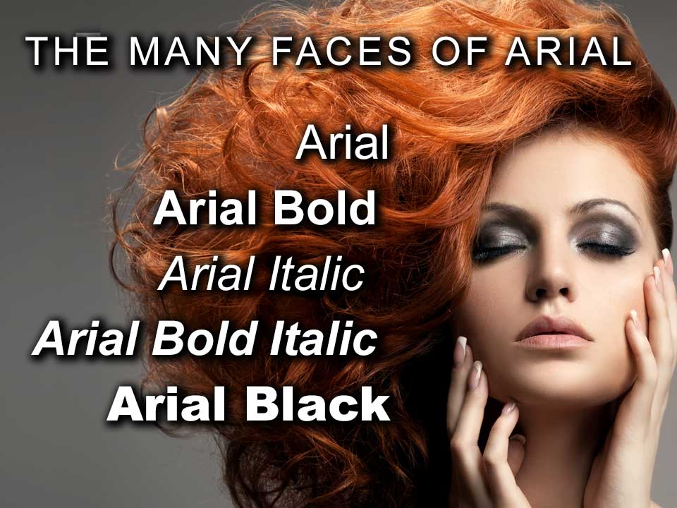
- Arial comes in a full range of weights: Arial Regular, Italic, Bold, and Bold Italic plus a full family of Arial Narrow; and Arial Black.
- In a slide deck Arial Black is particularly useful for big, bold headlines.
The downside is that Arial is viewed by some as mundane and unexciting. But in visual presentations, where legibility and versatility are critical, using the full family of Arial makes for a sensible choice.