When we present numbers to our audience, just like when we present other content, we must help them make sense of it — what does it mean to them? Often we feel compelled to show all the data in a table or list to give a sense of the big picture or to establish our credentials as an in-depth expert.
However, a large amount of information should probably not be left on the screen for any length of time. It can be too unfocused and distracting — allowing your audience’s attention to wander around into information you are not currently discussing. And, of course, large quantities of numbers require small typefaces to fit on the screen — never a good choice.
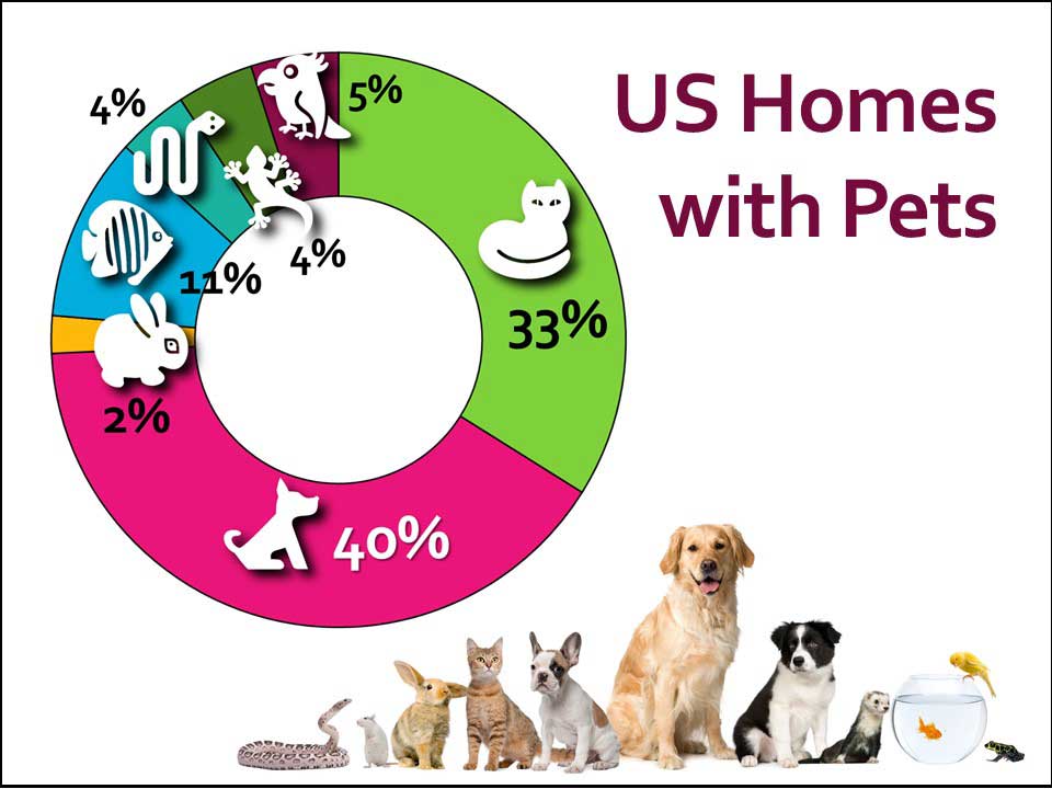
If a table filled with numbers in labeled rows and columns is a start at making sense out of a set of data then a graph with selected information is the next level. A graph represents numbers as graphic quantities so your audience gets a chance to read the numbers and see some sort of visual relationship — this should improve comprehension.
The pie/doughnut graph above keeps the amount of information manageable — it does not list every possible type of pet — only the categories relevant to the presentation. And it shows each category’s relationship to the whole. Plus adding icons helps the viewers quickly grasp the content while adding visual interest.
Next week: Illustrate your numbers