Taming Slidezilla: How to simplify a text-heavy slide
By far the biggest complaint I hear about bad visual presentations using PowerPoint or any other slide creation program is the practice of loading up a slide with text and then reading it from the screen. The tendency is to put all the required information — plus a little extra to prove the speaker’s authority — into a few slides. But communication and retention fall to zero as the quantity of the text increases and the size of the fonts decreases.
The process to fix this is fairly simple but it does require that the presenter put in some extra effort and remember that he or she is there to communicate with the audience and not just “get through” the presentation.
- Slide A. A typical text-heavy slide with small fonts — the kind that terrorizes audiences.
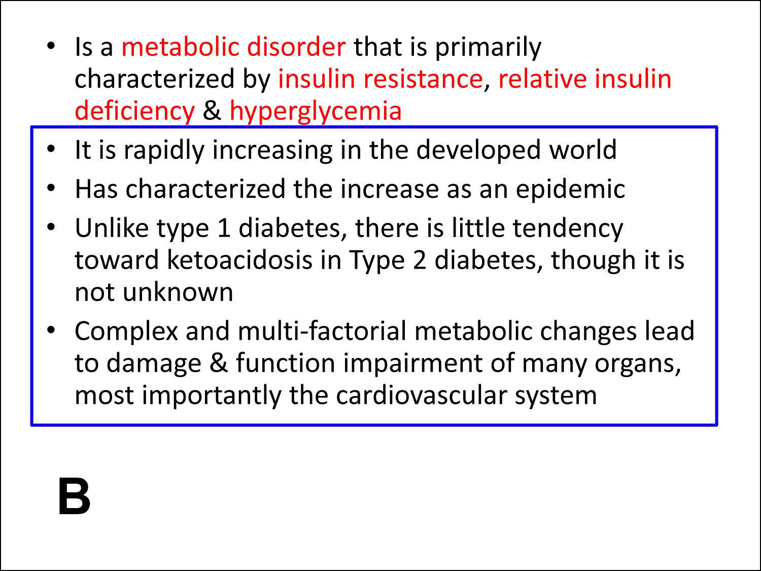
- Slide B. The first step is to determine the critical information (highlighted here in red). The blue box shows additional, non-essential material that can be mentioned from the podium, assigned to additional slides or to a handout.
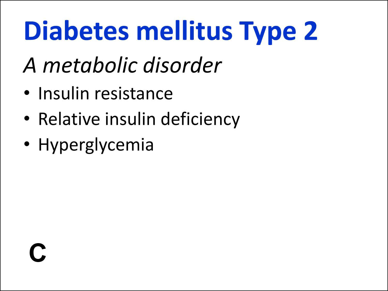
- Slide C. Here we are showing only the critical text, enlarged and placed in quick, easy-to-read bullets. Also we have added a missing headline and a subhead that helps explain the headline further. The omitted details (from the blue box in Slide B) can be covered orally by the presenter as needed.
Headlines are the most important piece of text on any page, web site or slide. They draw the reader’s eye, tell them this is something important and let them decide whether or not continuing is worth their time. Make your headlines big, bold and descriptive! - Slide D. A simple, appropriate and high quality graphic adds to the look of professionalism even though it doesn’t necessarily contribute to the content.
- Slide E. Notice how changing a graphic can completely alter the tone of the slide.
One note: Technical audiences may be wary of over-simplification or “dumbing down” your presentation. Be sure the viewer’s needs are kept foremost. Consider showing full data or details and then use a “zoomed-in” slide to focus on the content you wish to discuss.
Simplifying your slides means presenting the material in the way that best connects with the audience. It is very difficult for viewers to take in and retain large amounts of data from a PowerPoint slide no matter how much we want them to. Use PowerPoint to support the presenter and handouts for the details.


o o o Copyright © 2012 Tom Nixon Design o o o
Tom Nixon, delivers keynote presentations and workshops on effective PowerPoint presentations. He has over 30 years of experience in the graphics world as a photographer, designer and writer helping clients of all sizes deliver powerful, clear communications. He may be reached at 770.289.0752 or at tomn@tomnixondesign.com.