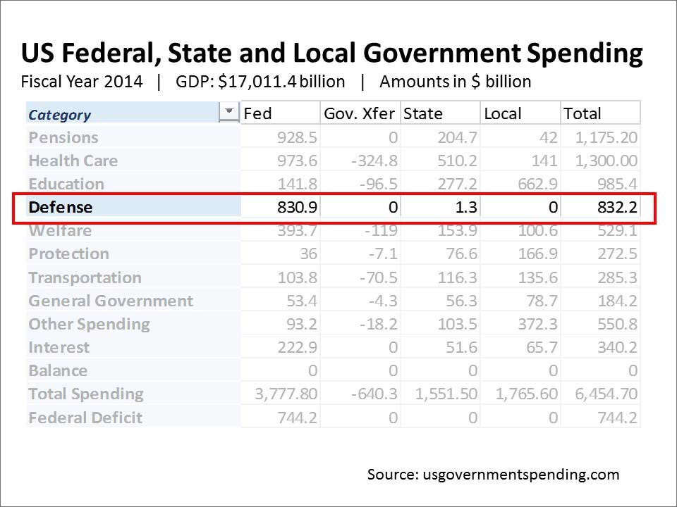
A common problem with updating and improving an existing (and probably tedious) slide deck is how to effectively revise a slide filled with data. We have all seen and possibly used a big Excel data file to generate a table filled with many numbers. The difficulty for the audience is how to make sense of a screen filled with numbers in which all are similar in size and therefore importance. Presenters often resort to the use of a laser pointer — a bad and irritating solution.
There is a simple and quick fix — draw a bright red box around the data you wish to focus attention on. If you are walking your viewers through a number of different parts of the table, create duplicate slides and move the box from one section to the next. The obvious advantage of this is that you are narrowing their attention to what you wish to discuss while showing the entire range of information.
The disadvantages are that you are still clogging up the screen with a lot of information — more than the audience can easily assimilate. If your data set is particularly large your text may be very small. Highlighting a few of the numbers will only draw attention to the fact that they can’t read them because of their size.
In the example above, I have also created semi-transparent white boxes to partially obscure the data I was not discussing. Download a factsheet to show you how.
Drawing a box like this may be a quick way to improve your data-heavy slides — give it a try.